Bold identity for Brazil's leading headshop printer

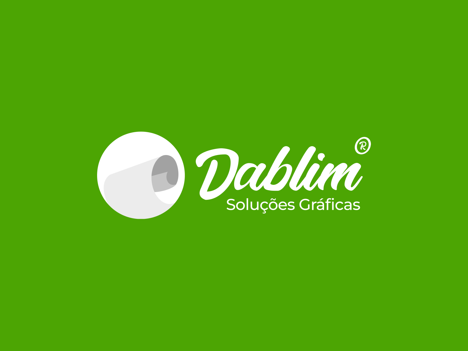
Dablim logo design

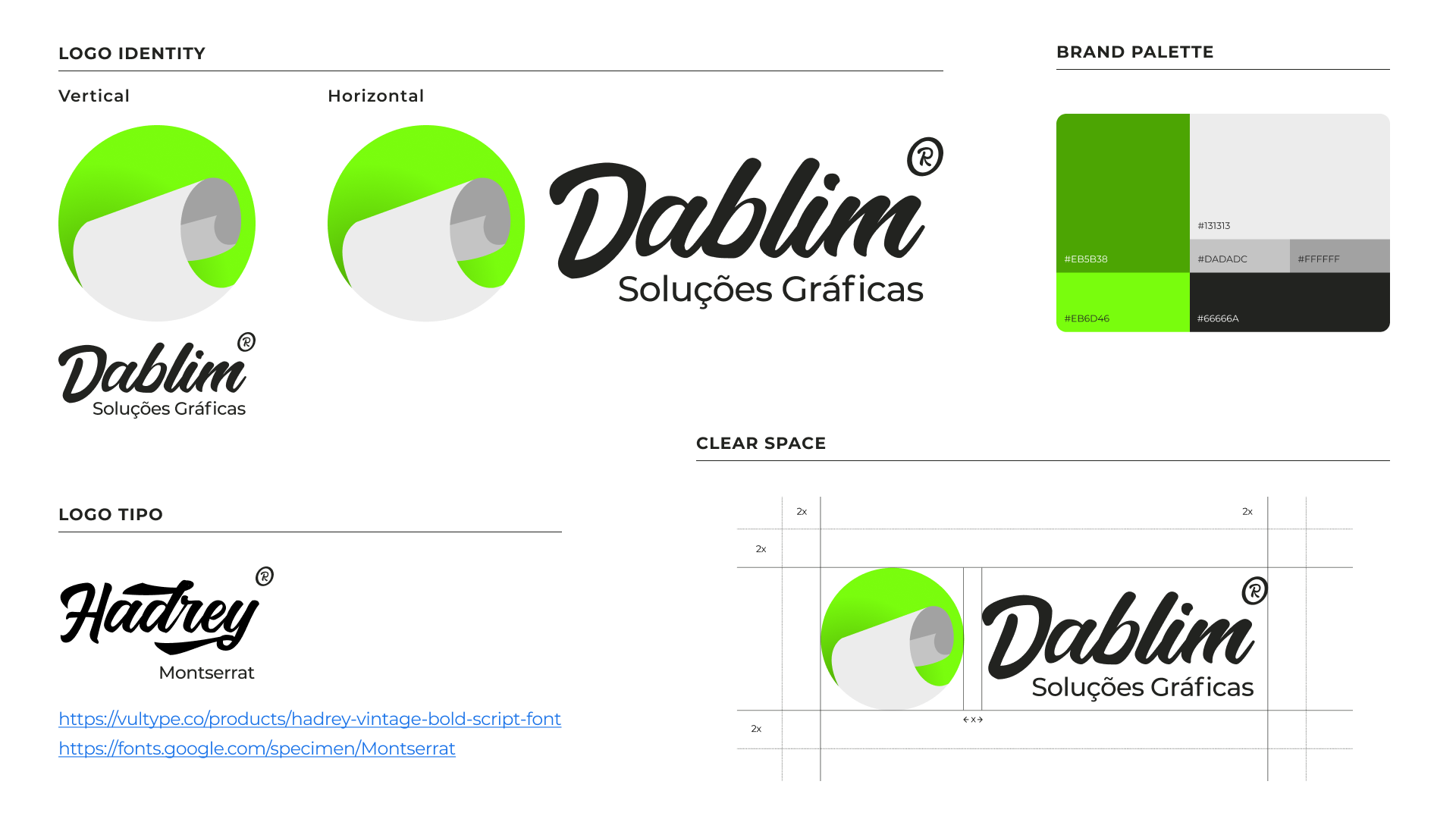
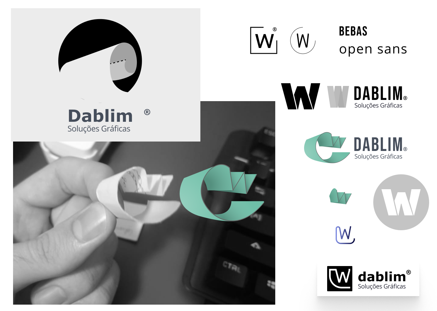
Creating the Dablim logo was an inspiring process that allowed me to blend creativity with strategic thinking. The design concept centered around the idea of paper folded into a 'W' shape, reminiscent of how the products Dablim produces will ultimately be folded for effective use. This subtle reference not only ties back to the brand's core business but also adds a unique touch to the logo.
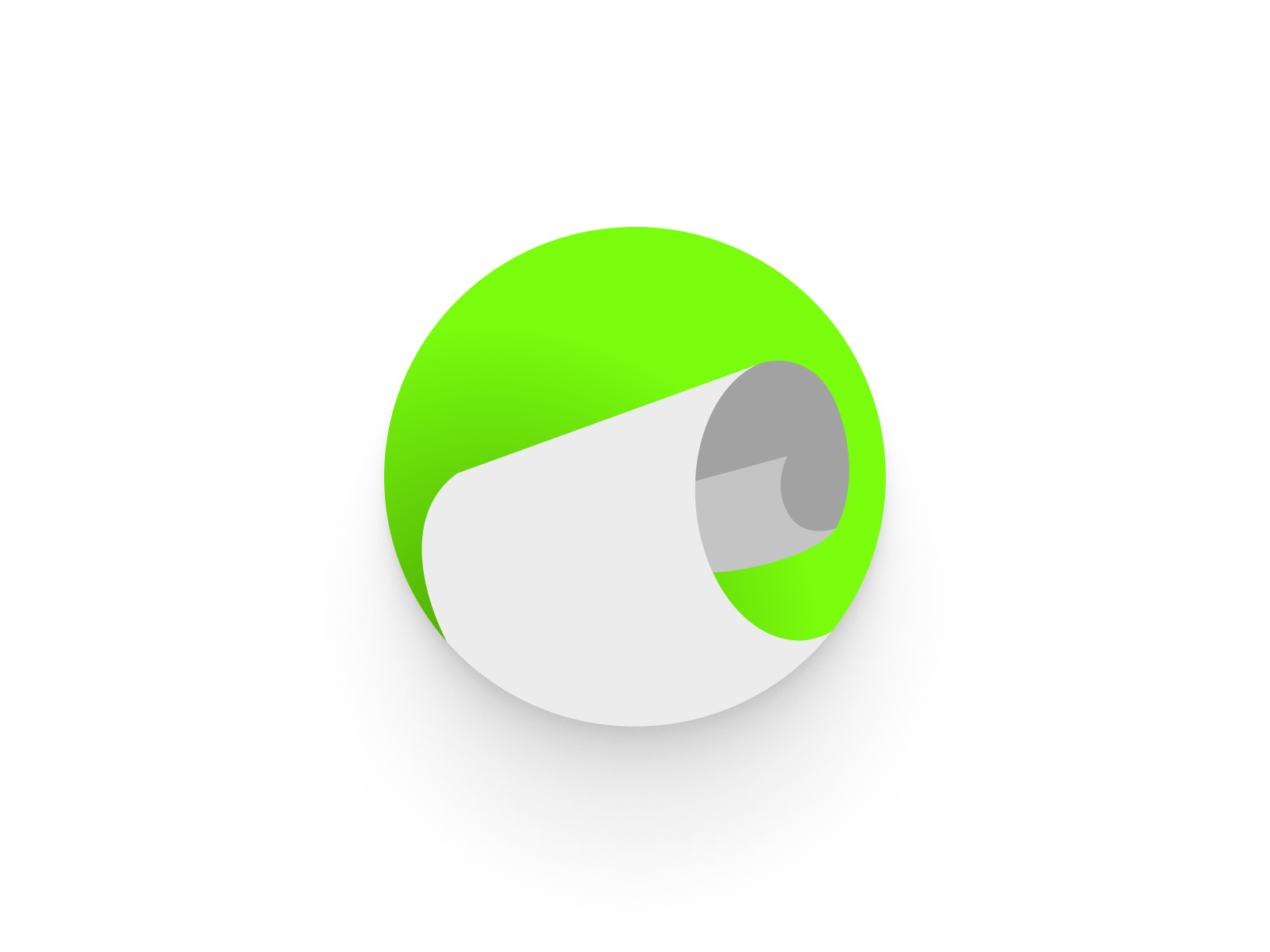
To enhance its relevance to the industry, I selected colors that resonate with the context of tobacco and headshops. The chosen palette not only captures attention but also reflects Dablim's commitment to quality and personalization.
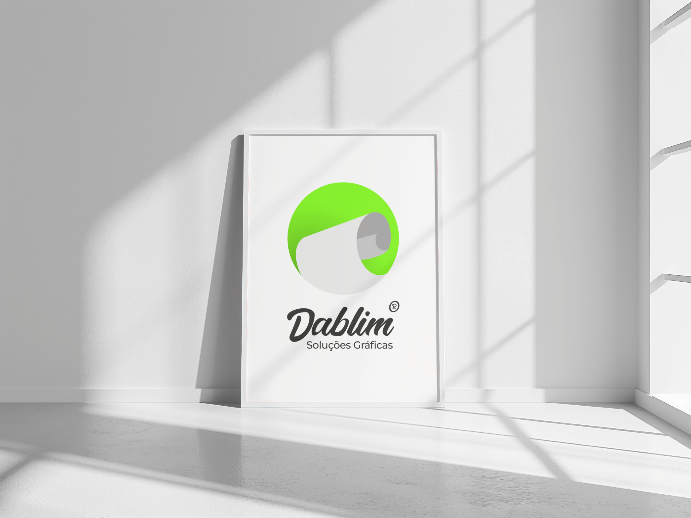
Overall, this project reinforced my belief in the power of thoughtful design—how even simple shapes and colors can effectively communicate a brand's identity and mission. I'm excited to see how the logo represents Dablim in the market!

“He became one of the best UX and CRO professionals I've ever known, with a great user understanding and a unique focus on the product.

He worked on the new UX initiatives that resulted in significant revenue/conversion growth and the launch for our MDM enterprise product.”
Ricardo Amaral
CEO at Optimal
"Guilherme is a very dedicated and proactive professional. He helped us in the redesign of the portal Um Diabético and in its maintenance. Always willing to help and put his knowledge into practice. A young guy full of desire to contribute to the company in the best way possible. Thank you for all your dedication. May our partnership be long-lasting."
Tom Bueno
CEO & Founder at TBContent
“Working with Guilherme Caiola means knowing that our theoretical ideas will come to life. He is a well-rounded professional, with strong skills in both programming and design.”
Maurílio Goeldner
Journalist and Creative Lead at Mais Comunic

Check more works

Let’s talk

Design & Business.

Let’s make impact.